CONTRIBUTION
A. A radial visualization with points of interest: POIViz
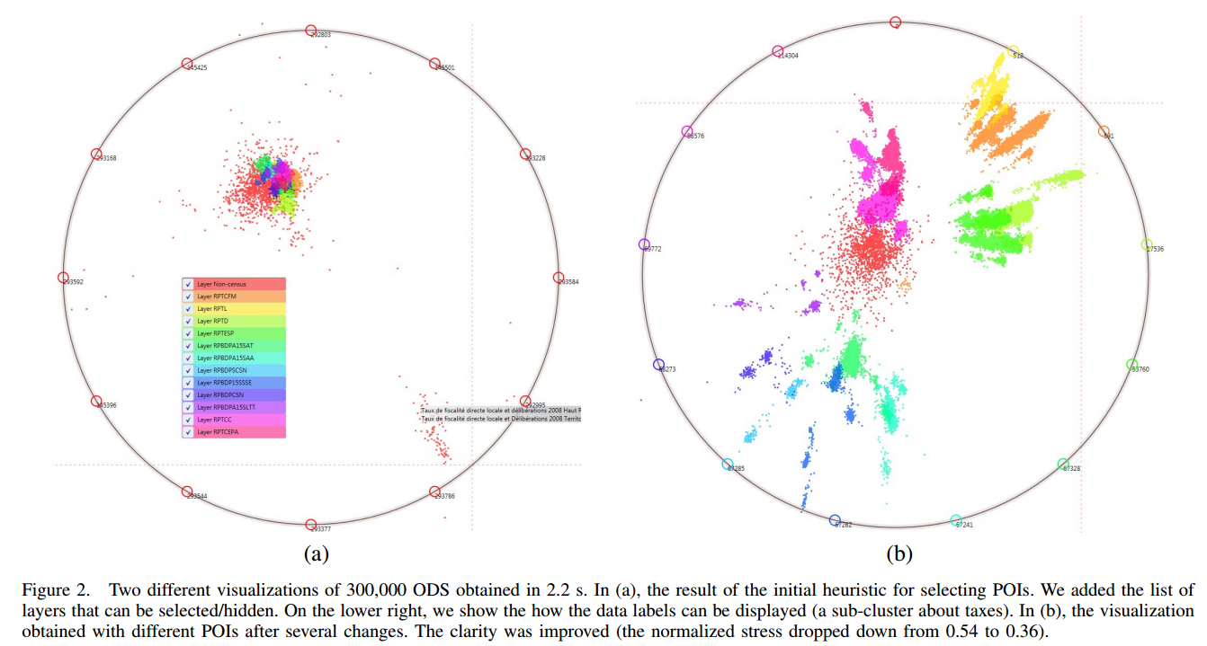
POIViz uses the principles of radial methods: a set of anchors (called points of interest in POIViz and subsequently denoted by ) are placed on a circle, and the data items (respectively denoted by ) are displayed within this circle at a location that depends on their similarity with the anchors (see Figure 2, and our earlier work [12]).
- In
POIViz, the anchors can be a subset of the data, i.e., specific data items of interest, like representative examples, outliers, centers of clusters, etc. - Anchors can also be fictive data that can represent a target to be reached, or they can also be a concept, like "all data such that Gender=Woman" whatever the values of the other attributes.
In the following, for simplicity, we will consider that anchors are a subset of data items, and that the similarity between data items and POIs can be evaluated with the Euclidean distance.
These anchors can be initially selected with a simple heuristic and then improved with the user interactions. Our simple heuristic consists in
- selecting the POIs in the dataset,
- in trying to find POIs that are as much distant as possible to each other.
We observed experimentally that those distant points are likely to give a good starting point (but not an optimal one). To find such data points, a simple random search algorithm can be used to improve the current list of POIs:
- it randomly changes a POI in the list to an other randomly selected data item, as long as a the order projection methods such as FastMap [9].
- Then, the order of the POIs can be optimized by placing next to each other POIs that are similar. In this way, similar data will be attracted toward similar locations in the circle.
To achieve this, we use a rearrangement clustering algorithm called BEA [13]. Once this order is determined, the space between the POIs can be adjusted according to the similarity between them.
After this initialization, the user can interactively add or remove POIs. The visualization can thus be improved according to what is observed in the visualization. The user might also get and explore different view points on its dataset
B. Improving the visualization: parallel computation and density rendering
Several improvements were performed to our radial visualization to enhance the visual representation of large datasets and ODS, with the constraint of keeping the processing times as low as possible. This resulted in a new visualization called POIViz. A key-point was to use parallelism at every crucial steps of the method . This parallelism combined the multithreaded CPU and the GPU. The computation of the data layout coordinates was the most important step to parallelize.
This computation mainly consists in computing Euclidean distances between the data and the POIs, and then computing a weighted barycenter for every data item. This step was thus parallelize on the CPU or on the GPU. The GPU was better
suited for large values of n (up to 14 millions) while the CPU could better deal with large dimensional spaces (up to 1000 dimensions). The speedup from a sequential CPU to a multi-threaded GPU was about 65, and the speedup from a
multi-threaded CPU to the GPU was about 17. Other steps of POIViz were parallelized, like the loading of the dataset, the display of the data and the interactions.
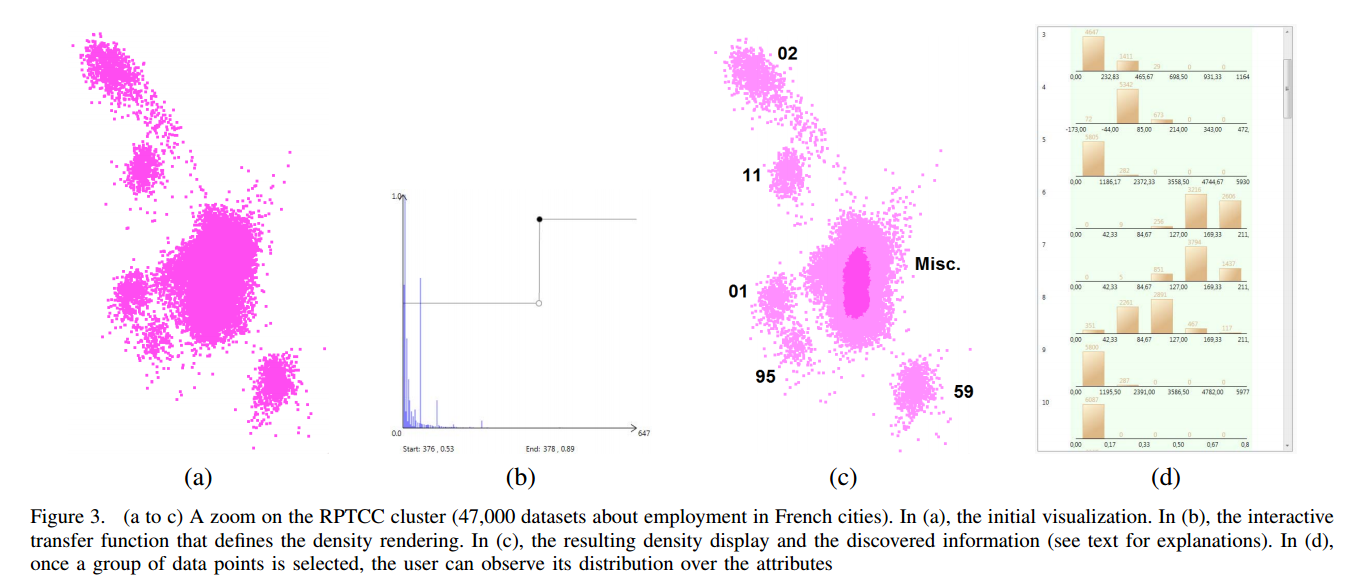
Other improvements were performed on the visualization itself, like its graphical rendering. When dealing with many data points, the rendering of the dataset can suffer from overplotting [15]. The size of a data point was reduced to 1 pixel. However, this was not enough to avoid over-plotting, and furthermore, when the user zoomed in a lot, over plotting was reduced, but a 1 pixel size was too small. Therefore, we use a variable data point size, that the user can adjust to obtain a correct representation. To avoid over-plotting and to give a better idea of the distribution of dense clusters, we used a density-based rendering, in which an opacity can be assigned to each pixel according to the number of data items in that pixel. A transfer function was used to let the user personalize this rendering (see Figure 3). One important point for the success of this approach is the speed of the display: in POIViz, the adjustment of the transfer
function can be done in real time, even for large dataset (see Section IV.D). So the user can dynamically change the transfer function and observe the resulting rendering.
C. Data selection, filtering and labeling
In POIViz, the user can select data of interest by drawing a selection box in the graphical representation. Several actions are then possible after this selection, like data filtering or labeling. In POIViz, the visual representation of the datais based on the concept of interactive layers that the user can create and select/hide for the display.
- In the case of supervised data, then a layer can be automatically associated to each class. Each layer contains the data points of its associated class. This feature can be useful to compare classes for instance, or to find a set of POIs that can well separate two classes or more.
- Alternatively, with unsupervised data, the user is able to select a group of data points (i.e., a cluster) and to assign it to a class and a layer. This layer can be an existing one (the data points belong to a previously defined cluster), or a new layer (a new cluster is created). With these features, the user can perform an interactive clustering of the data. This interactive labeling can also be used in the supervised case, to change the class of data points or to create a new class.
- Indeed the user can export these discovered clusters or classes by selecting the layers of interest (or all of them). A new attribute is added to the dataset to represent the layers.
D. Navigation and changing the visualization
The navigation in the visualization is a common but important action that must be quickly processed. POIViz uses standard zoom and pan actions, but with some adaptations for large datasets. When the user wants to change the level of detail, he or she often needs to adjust the zoom level and the pan so as to focus on the area of interest. Finding the right area of focus requires several zoom (in and out) and pan actions. With a large dataset, this navigation sequence can be a problem if it is not processed quickly enough. So in POIViz, we implemented a two steps procedure for the zoom and pan: we deal with the zoom/pan sequence at a fast interactive rate (very close to the mouse events rate), providing a rough idea of the result in a very short time. In parallel, the final visualization is computed on the multithreaded CPU. If the user stops the zoom/pan sequence, the final result is displayed. The user can observe the resulting visualization. If the area of focus is not convenient, a new zoom/pan sequence can be started. Alternatively, the user can be satisfied with the new focus and can continue the data exploration.
One important feature of POIViz is that the user can more deeply change the visual representation and obtain a new visualization in a few seconds. More precisely, if the user wants to change a POI or to select a specific subset of dimensions (to see if the impact of discarding some dimensions is important or not), then a new layout must be computed. One strength of POIViz is that such a layout can be very quickly computed, unlike other projection methods with a complexity that is above the linear time. Therefore, we were able to include several such features in our visualization. Changing the POIs is an important feature because the POIs determine the layout of the dataset. It is a way to obtain new view points on the data, or to check various hypotheses that can be evaluated according to their visual effects. As mentioned in Section 3, a first initial set of POIs can be provided with a heuristic. In the case of supervised data, an alternative consists in automatically choosing one POI in each class. We observed that this is also a good set of initial POIs. Then, several interactions can be used to change the POIs and the visualization. A data of interest can be selected in the visualization and turned into a POI. In this case, the selected POI can be automatically inserted in the existing POIs using the rearrangement clustering algorithm.
Alternatively, a POI can be removed. This might happen if the user considers that an added POI is not useful (for instance, it does not clarify the representation). Another possibility for adding a POI is to select a group of data points, to compute the multidimensional centroid of this group, and to add it to the circle. POIs can also be edited, to drop some dimensions: the user can decide to remove some dimensions so as to check if such dimensions are really important or not from the visualization point of view. If the visualization is not affected by removing a dimension, then this might mean that the dimension is useless. With such a feature, the user can check some hypotheses about the dimensions.
E. Finding conceptual information
In projection methods, data items are considered as 2D points. This indeed can reveal important information to the user (like the presence of clusters), but however, users are also highly interested by more conceptual information (like
finding why such data are forming a cluster). In POIViz,we developed some features along this direction, with the aim of helping the user correlate the 2D based discovered information (as provided by the projection method) with the
multidimensional information (as provided by the initial data table).
When a set of data points is selected, the user can obtain additional information about the distribution of these points over the attributes. For this purpose, we designed a histogram based visualization. One histogram is associated to each attribute. Using this principles, the user can check if the selected data has a different distribution than the overall data,and for which attributes (see Figure 3(d)).
 Open Data, and more generally documents, can have specific properties such as titles or meta data. It is important to visualize such textual information in the visualization because it will help the user in understanding the observed data. For instance, observing the titles of data items grouped in a cluster can help the user understand to what this cluster corresponds to. A possible option for displaying textual information is to permanently display labels over the data points. When dealing with large datasets, this might raise some problems to determine the layout of such labels.
Furthermore, a real time computation of labels layout might be difficult to achieve. So here we selected a simple approach that can be rendered in real time. Whenever the mouse is placed on an area that contains data points, the titles of such points is immediately displayed. Because many data points can be rendered on the same area, we limited the number of displayed titles.